download animation
free animation carton
animation
Showing posts with label tutorial. Show all posts

Some Cute (And Not So Cute) Doodles!


I make no bones about the fact that I love to draw cute characters. Cartoons that are cute and appealing are what I grew up with, and I still far prefer that over the ugly schlock of today, therefore that is what I gravitate towards in my own cartooning. Here are some more examples of recent doodles that explore that theme.


In the one above, I decided to scribble out several animated poses of the same little guy bouncing his basketball. Though I have never animated per se, I have always enjoyed bringing a character to life through continuity poses and expressions. Of course, this is the essence of what I have done for many years in illustrating children's books for Disney. Ideally I would love to start illustrating books with my own characters, but I'm not sure that children's book publishers even like cartoons anymore. Regrettably, they seem to have forgotten that the most famous kids' illustrator of all time, Dr. Seuss, was in fact a cartoonist.


These were a couple of quick impressions I scribbled of other diners at the restaurant I was at several weeks ago. The old guy reminded me a bit of Ed McMahon and the young girl had similar features to Drew Barrymore. The cat was not actually in the restaurant, but snuck into my doodling just the same.
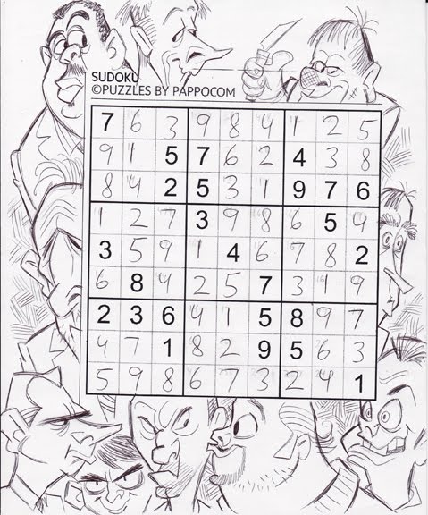

Okay, I guess these ugly rascals can't be called "cute", but they were fun to draw. After finishing up a Suduko, I started aimlessly doodling a couple of ugly mugs, which then led to a whole series of unsavory mobster types appearing around the edge of the puzzle. I particularly like the psychotic looking fellow in the lower right corner and the wall-eyed rascal in the top middle. The whole exercise was really meant to explore facial features of varying shape, size and relative placement on various head shapes, which is something I stress constantly in my Sheridan College Character Design class.

Drawing Cartoon Eyes

I came across this film still from Disney's The Princess and the Frog by way of John Kricfalusi's blog. John has been pointing out (quite correctly in my opinion) how badly designed and drawn the TV shows from the 80's were. Furthermore, he contends that those bland and soulless 80's character designs live on to this day, not only on TV but also in feature film animation. Though I might be rather more charitable towards Disney's features of the last 20 years, I can't say that John is off target in this criticism either, especially when I see an example like the following that he includes:


John's correct in his assertion that some of Disney's male and female leads are bland and generic in design. I too feel like Prince Naveen in The Princess and the Frog is highly derivative of Prince Eric and Aladdin who came before him. Ideally, I'd like to have seen Naveen designed more ethnically exotic in his actual features, rather than just his flesh colour, perhaps more like the young Omar Sharif, for example. However, despite this criticism, I will defend the actual drawing and animation of Naveen as being highly competent. He is solidly drawn, if uninspired in design.

I'm afraid, however, that I cannot say the same for the three young ladies looking so adoringly at Naveen in this particular scene (undoubtedly drawn by a different animator than the one handling Naveen). I'm sorry to say that I find the drawing of these three very amateurish - more the kind of drawing I'd equate with the aforementioned 80's TV animation. I recall thinking the same thing when I saw the village sequence that opened Beauty and the Beast. There were a lot of village folk very poorly drawn and animated in that film, though all of the principal characters were handled so well. I think things got better in subsequent films, however, and I was glad to see it. But, by virtue of The Princess and the Frog being Disney's first traditionally animated feature in six years, it looks like they're saddled with some newbie animators, likely by way of TV animation, who just aren't up to speed yet with their drawing.


As it happens, I've just lectured about the design and function in drawing eyes as part of my Character Design class at Sheridan this past week, so I'd like to offer my thoughts on that subject in regard to this particular still from the Disney film, as well as this suggested revision in some of the drawing. First of all, I find the construction lacking in the drawings of these three girls, especially when compared to the better drawn Naveen. I think the head construction on all three could be tightened up a bit, and the 2nd girl could do with a more substantial nose structure too. Mostly, though, it's the construction and direction of the eyes on all three that bothers me the most. Girl #1 has eyes that are spreading out too large and show no feeling of being spherical eyeballs behind the surrounding flesh, due to the pupils being drawn without regard to the rounded surface they exist on. Girl #2 at least has elliptical pupils, suggesting a turning of form, yet they are not even close to being directed towards Naveen's eyes in order to meet his gaze. I haven't drawn Girl #3, but her pupils, drawn as perfect circles, also show no indication of turning on a rounded surface and she appears to be looking at something offscreen beyond Naveen's left ear.

I must admit, poorly drawn and unfocused eyes are a big pet peeve of mine, as it it takes so little extra effort to draw them well. Here are a couple of notes from the lecture I give on cartoon eyes: